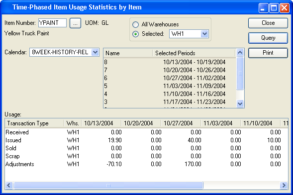
6.1. Graphical Report Output
The basis for our discussion is an existing report that is generated by xTuple in the module. The display is called Time-Phased Item Usage Statistics by Item and the report is generated by clicking the PRINT button.
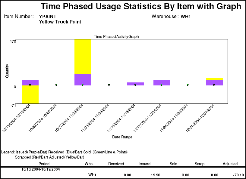
Data for the report can be viewed prior to initiating the report. Above we see eight weeks of historical information for a specified item in a specific warehouse. The standard report definition displays this same information in a vertical format on a printed page. However, with the report writer's graphing capability, we can display the same information visually as well.
To do this, the standard report definition was enhanced so that the header area at the top was large enough to accommodate the new graph. Then, the same columns in the query definition that were used in the body of the report to display the period were used to plot the Y axis. Likewise, the columns in the query definition that were used to display the quantity information (received, issued, etc.) were used to define the X axis. Let's take a look under the hood and see how this was done.