The report writer provides the capability to display information graphically. In this section we will examine this functionality by looking at how an existing report definition defined in the xTuple ERP application suite that displays inventory history can be enhanced to show the information in both numerical and graphical form.
The basis for our discussion is an existing report that is generated by xTuple in the Inventory Management module. The display is called Time-Phased Item Usage Statistics by Item and the report is generated by clicking the PRINT button.
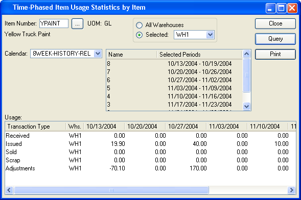
Data for the report can be viewed prior to initiating the report. Above we see eight weeks of historical information for a specified Item in a specific warehouse. The standard report definition displays this same information in a vertical format on a printed page. But, with the report writer’s graphing capability, we can display the same information visually as well.
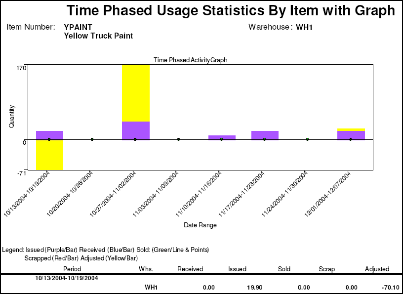
To do this, the standard report definition was enhanced so that the Header area at the top was large enough to accommodate the new graph. Then, the same columns in the query definition that were used in the body of the report to display the period were used to plot the Y axis. Likewise, the columns in the query definition that were used to display the quantity information (Received, Issued, etc.) were used to define the X axis. Let’s take a look under the hood and see how this was done.
The nature of a report definition that displays information graphically is fundamentally the same as one that displays information textually. Indeed, a report definition that displays numerical information is often a good candidate for graphical enhancement.
Below we see the report definition for the Time Phased usage Statistics By Item after the section Report Header has been enlarged and a Graph object has been added to it:
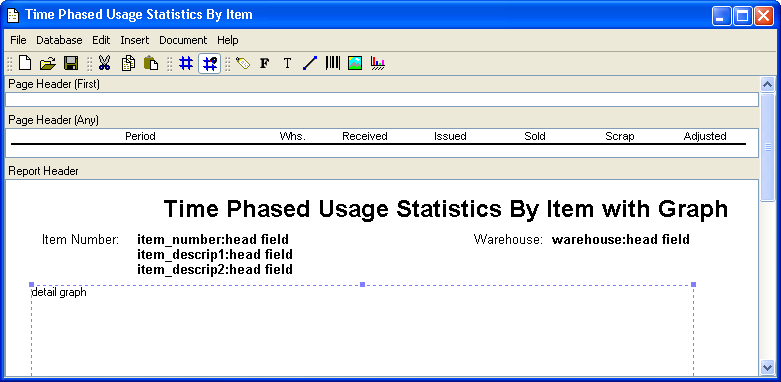
A Graph object is added using the graphing tool on the toolbar. Start by clicking on the graphing tool. Then, click on the area in the section of the report definition where you want the graph to display. Next, resize the resulting Graph object box with your mouse. Finally, double-click on the Graph object to define detailed information about its behavior.
We will cover Graphing object definition shortly. First, let’s take a look at the SELECT clause in the report’s Query Definition to see the origin of the column values that will be used to define values and information for the X and Y axes.
The SELECT clause in the SQL statement that is used in the report’s Query Definition is shown below. It is important to note two factors in relation to this query source:
The existing report definition’s query source was not modified in any way to accommodate the graph.
The SQL utilizes embedded PL/pgSQL (the PostgreSQL Procedural Language) functions
summTransR(),summTransI(),summTransS(),summTransC()andsummTransA()to actually query the tableinvhist.
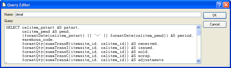
Ultimately the query returns values for columns: received, issued, sold, scrap, adjustments, and period. These will be used in the graph’s definition to supply the dynamic data upon which the resulting graph will render the information visually.
Colors must be defined for each report writer report definition. We will assign our color definitions to the bars, lines, points that define to display the graph.
To define colors:
Pull down the report writer’s Document menu
Click on the option “Color Definitions”
You will see the Color Definitions screen:
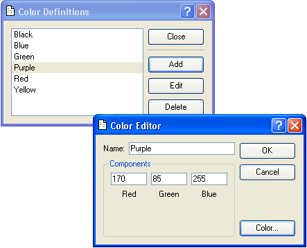
The color Definitions Screen enables you to add, edit, and delete a color. To add a color, click the ADD button. The report writer displays the Color Editor screen. You may define a color in two ways:
If you know the levels of Red, Green, and Blue that define the color you want simply enter the color’s Name, fill in the values in the Components fields, and click the OK button.
You may also have the Component values filled in for you by entering the Name for your color and clicking the COLOR button. This displays the Select color screen which provides a color palette.
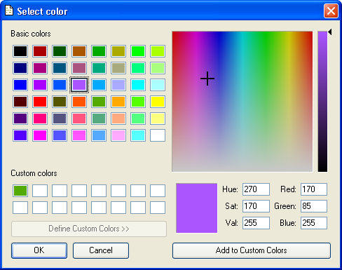
You may use the color palette to select the exact color you want to define. When you click the OK button, you are returned to the Color Editor screen. The color Component values are filled in for you based on your selection.
Now that we have looked at the query source and identified the columns that will provide the data we want to graph, and we have defined colors that we will associate with bars, lines, and points in our graph, we can define the details of our graphing object. Double-clicking on the Graph object we placed in our report definition displays a dialogue with four tabs. Let’s take a look at each:
The most significant aspect of the General tab is that it is the place where we link our Graph object to a query source. We also can precisely control the size and location of the graph on the report give it a title and assign a base Font that can be used throughout the rest of the Graph object’s definition or overridden by exception.
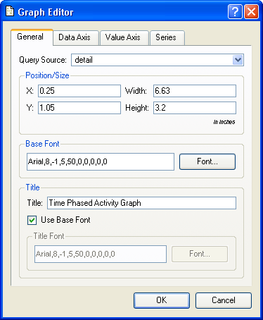
The Graph Editor tab provides the following options:
- Query Source
From the pull down list select the query source that provides the columns containing the values you want graphed.
- Position/Size
It is easiest to simply drag the Graph object in the report definition and resize it with your mouse. However, for very precise control you may enter X and Y coordinates for the location and a Width and Height defined in inches.
- Base Font
You may click the FONT button to define the characteristics of a base font for your graph. Then, on other tabs in the Graph Editor, simply check “Use Base Font” to select it for use on that element of the graph.
- Title
Enter the title you want to appear above (but within) your graph
Next we will define the Data Axis.
The Data Axis tab in the Graph Editor defines your graph’s X axis.
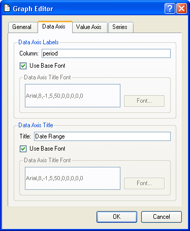
You may define the following information in the Data Axis tab:
- Data Axis Labels
The column field in this section refers to columns that are the query source you referenced under the General tab. This column contains the dynamic data you want displayed along the bottom of the X axis. In our example, the column
periodcontains the date for each period that will be displayed in our time-series graph of inventory activity.- Data Axis Title
This section enables you to provide a static description for the X axis that displays along its base.
Both sections under the Data Axis tab enable you to select the base font defined under the General tab, or, leave the option unchecked and use the FONT button to specify a different font and size.
Now that the X axis is defined, it is time to define the static information and other parameters that control the Y axis.
The Graph Editor’s Value Axis tab enables you to define properties of a graph’s Y Axis.
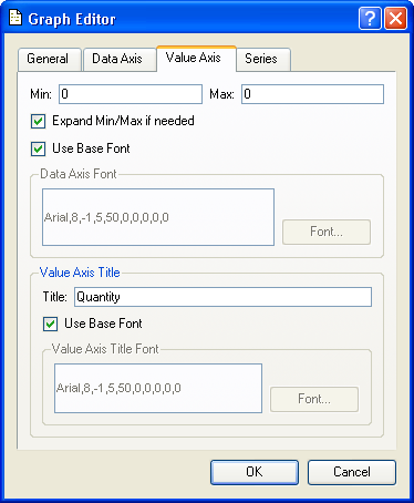
There are two main sections in the Value Axis tab:
- Min/Max
The Min/Max values control the minimum and maximum value that will for displayed for a graphed element. If the values are set to 0 and “Expand Min/Max if needed” is checked, the limits of the Y axis will equal largest and smallest graphed element.
- Value Axis Title
The value of the field Title is static and will display vertically along the Y axis of the graph.
Both sections under the Value Axis tab enable you to select the base font defined under the General tab, or, leave the option unchecked and use the FONT button to specify a different font and size.
The Series tab in the Graph Editor enables you to define one or more series that are plotted on your graph.
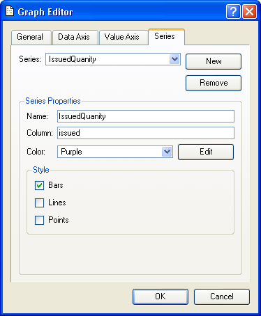
To Establish a series click the NEW button and then fill in the following:
- Name
Assign your new series a descriptive name. This name is for internal reference only and is not displayed on the graph.
- Column
Link your series to a column in the query source (linked to the graph under the General tab) that contains the information you want graphed.
- Color
Select from the drop down list a color that you defined earlier. You may also click the EDIT button and define one or more new colors.
- Style
Check one or more styles to define how the data will display in the graph:
- Bars
Displays the series in bar format, or stacked bars for multiple series defined as bars.
- Lines
Displays the series in line format.
- Points
Displays the series as a point on the graph.
If you want to continue by adding another series, click the NEW button. The series you are defining is saved and all values cleared so you can defined the new series’ properties.
If you are done entering series information, you may click the OK button to exit the Graph Editor, or click on another tab under it.
This completes the mechanics for defining a graph in the report writer. Earlier in this section we saw the output of a report with an embedded graph. The definition process was easy and straight forward. The graphing capability enables you to quickly enhance existing reports or define new reports that improve how complex information is presented to users.